Why apply now is a terrible call-to-action for your marketing campaign
Inspiring, clear, inviting, actionable—these are the words we think about when building a call-to-action. We want to tell our visitors exactly what we want them to do next, and as enrollment professionals, we want them to apply and enroll. But maybe that isn’t the goal we should be focused on when it comes to our marketing campaigns.
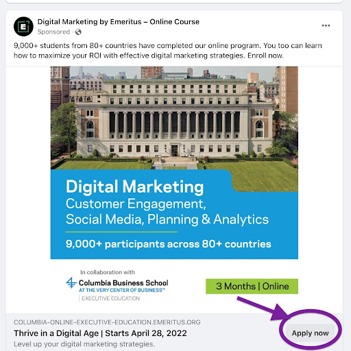
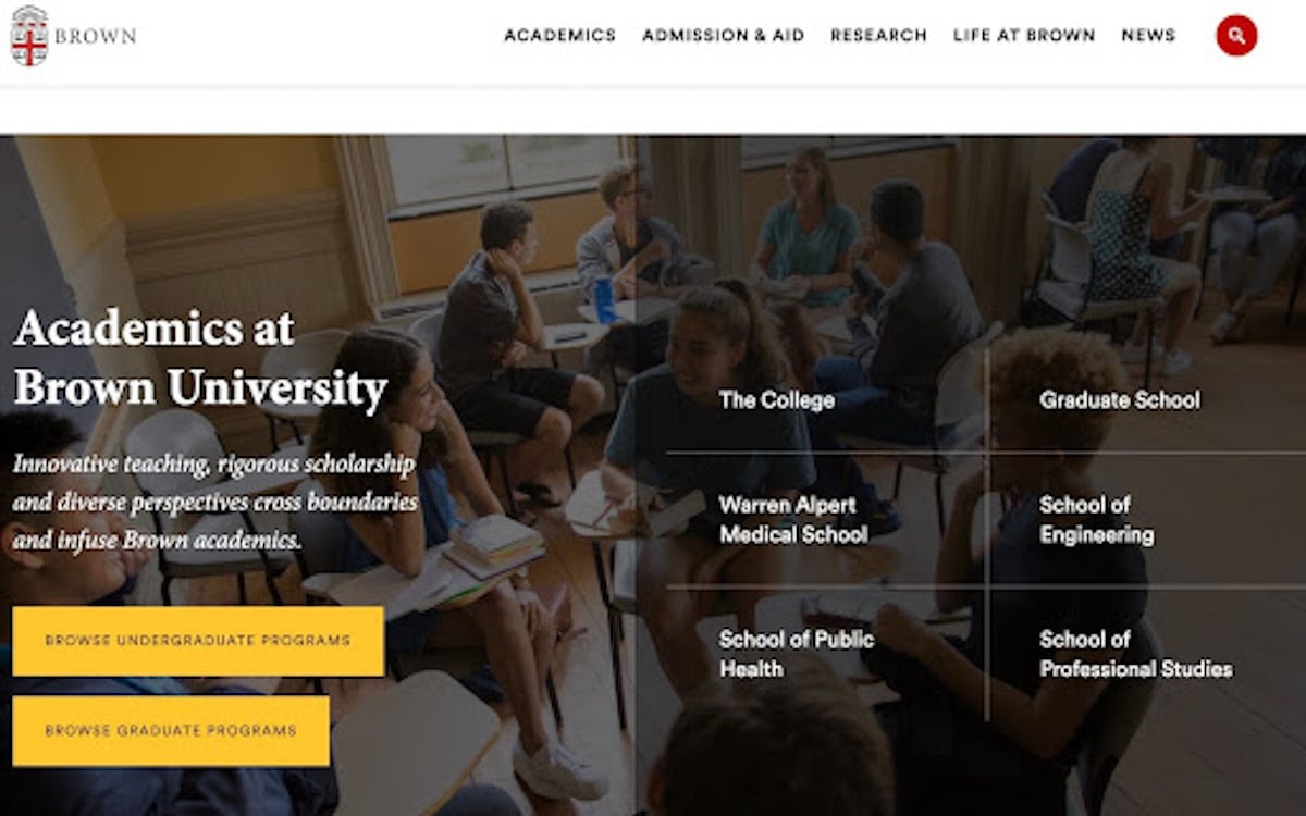
In higher education, we must remember we are building websites and pages that attract everyone from enrolled students to those just beginning the process of considering higher education. When students visit university pages or view college ads, they are bombarded with Apply Now buttons, but only a fraction of those visitors are even close to being ready to apply.
The culminating goal might be to get prospective students to apply, but if they aren’t ready to apply, we are missing opportunities to encourage them through the process toward the decision to apply.
What is a call-to-action?
Let's step back and define a call-to-action. According to OxfordLanguages, a call-to-action is “a piece of content intended to induce a visitor, reader, or listener to perform a specific act, typically taking the form of an instruction or directive.”
In marketing, we tend to take this to mean we must clearly tell our readers what we want them to ultimately do; buy now or apply now since those are our ultimate goals. But nowhere in that definition does it say a call-to-action must jump to the end of the process. All we want to do is inspire prospects to take the next step and there are many steps between visiting a website and applying to a university.

Why does your call-to-action matter?
Your call-to-action is a powerful conversion driving tool. The copy, color, context, and button design can impact click-through and conversion rates significantly. While there’s no one secret code to CTAs, simple trial and error tweaks pack a punch when it comes to driving conversion rates. According to Protocol 80, Inc. one company saw a 45% increase in clicks by making their CTA’s look like buttons while another increased sales by 1617% by adding CTA’s to emails.
As marketing and enrollment professionals, these powerful little tools are a missed opportunity if you’re sticking with Apply Now. Imagine changing the two words in that button, making it a new color and watching your click-through rates skyrocket. Tweaking your calls to action can impact enrollment significantly with very little marketing effort or budget consumed.
How do you audit CTAs?
In order to optimize your CTAs, you need to know where you are starting from and be tracking the impacts of your changes. Google Analytics allows you to track the success of CTAs by setting up event tracking which will help you see which call-to-action links are driving your traffic.
Event tracking allows you to see if your call-to-action buttons on landing pages are outperforming those from email campaigns or if your paid advertising call-to-action is more effective at driving traffic. Ultimately, you can then work to optimize every call-to-action link.
So what is the problem with Apply Now?
As we have touched on already, the Apply Now CTA is limiting and misses opportunities to drive a wide range of prospective students toward enrolling. Good CTAs are targeted, specific, and meet your users where they are in their process. Think of them as street signs rather than welcome signs. You want to present the next path that will lead them toward the welcome sign.

Apply now should only be used as the call-to-action after you have taken the student on a journey to that final turn. If it is the only CTA you present over and over again, it provides no value to your visitors and will perform poorly.
Creating alternative CTAs
What are the calls to action that will help drive conversion? Think of building CTAs that guide students through your site question by question.
Do they need to know about tuition costs and financial aid? How about a call-to-action that says explore scholarship opportunities. They might be figuring out what they want to study; how about a button that says click here to find a degree that matches your interests. Highlight your athletics with a CTA that says Become a Wildcats Superfan today.
Think about where and when you present each call-to-action based on the “moment” that a student who is browsing any given page may likely be in. Landing pages should encourage prospective students to continue exploring so calls to action that center around learning more are effective. Lead the students to degree programs, financial aid, campus life, and intramural activities. Once they’re on the financial aid page, try going beyond a call-to-action to talk to a financial aid counselor and offer to give them an instant assessment in exchange for some of their information. Then sit back and watch your conversion rates soar!.

Know your audience
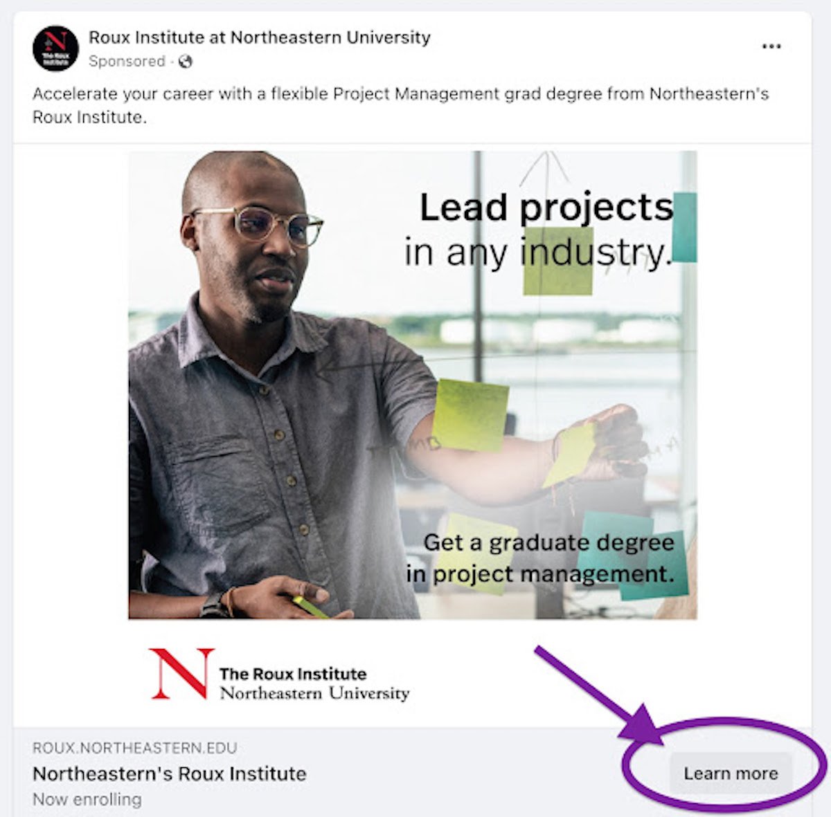
Apply now will only be effective once you’ve walked them all the way up to that point. Your CTAs should present value to your prospective students and be presented according to where they are at in their journey toward enrollment. Don’t expect students seeing your paid Facebook ad to be ready to apply when they are seeing your university name for the first time.
Create meaningful, targeted calls to action that move your prospective students down the marketing funnel. These are powerful marketing tools and by using them appropriately you are providing each prospective student a personal tour guide that walks them right up to the application process.

